

 EN
 PT-BR
[ Case 01 — Brand identity from scratch ]
Keystone OS.

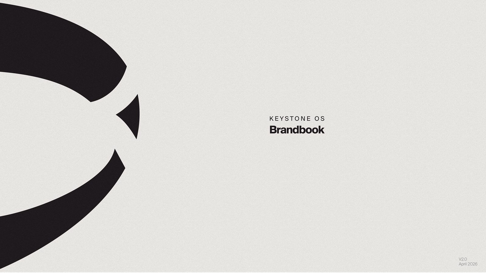
A neutral settlement layer for tokenized finance needed a brand that doesn’t pick a side. We built everything from a blank page: name lockups, logo system, brandbook and the website.
01 — The problem
Neutral needs a brand that picks no side.
KeyStone settles trades between ledgers, custodians and clearinghouses — and is never a counterparty. It holds nothing, matches nothing, bridges nothing. Rivals settle through it precisely because it can’t compete with them.
The obvious move in fintech is a blue gradient and a shield. That says “bank”, and a bank is exactly what KeyStone isn’t. The identity had to feel institutional, quiet and structural — infrastructure you trust because it stays out of the way.
02 — The idea
The stone that locks the arch.
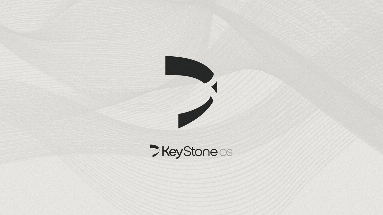
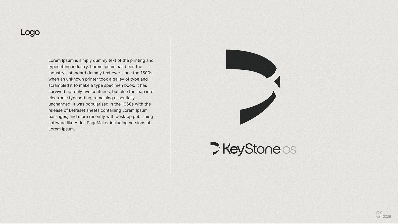
A keystone is the wedge at the top of an arch: remove it and everything falls, but it carries no side. The mark is built from three pieces that only make sense together — the same way every leg of a KeyStone settlement settles at once, or none does.
03 — The system
Palette — click to copy
Typography
Aa
Suisse Int’l — headlines & brand
Inter — interface & long reading
04 — The website
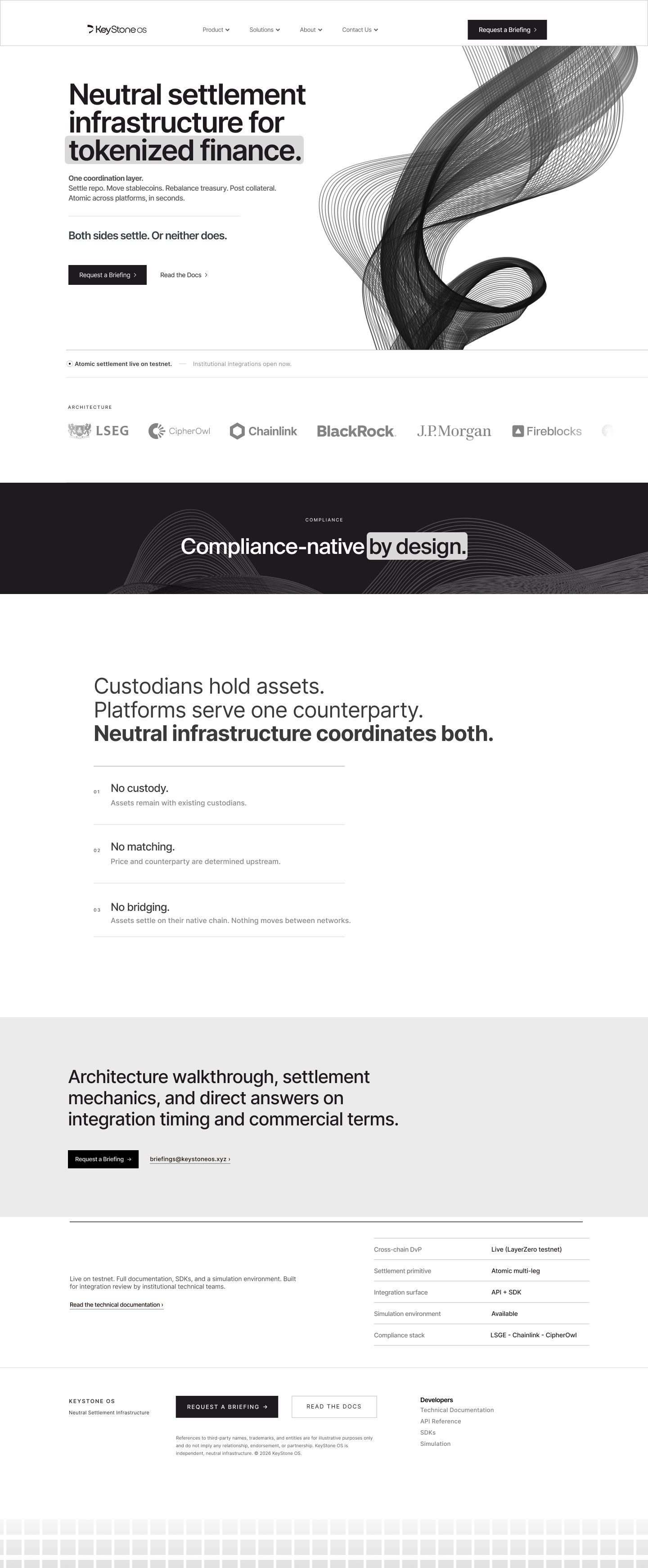
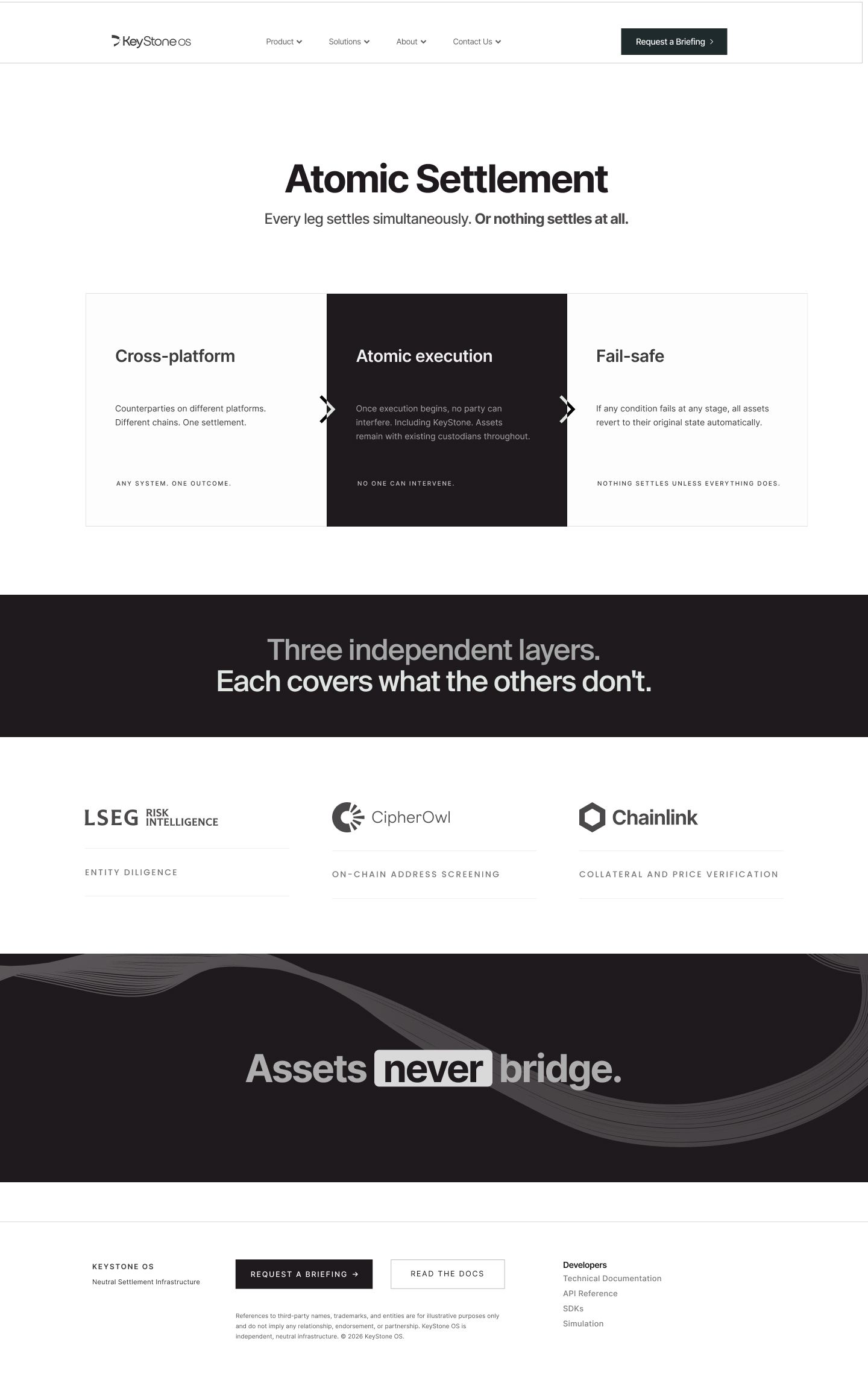
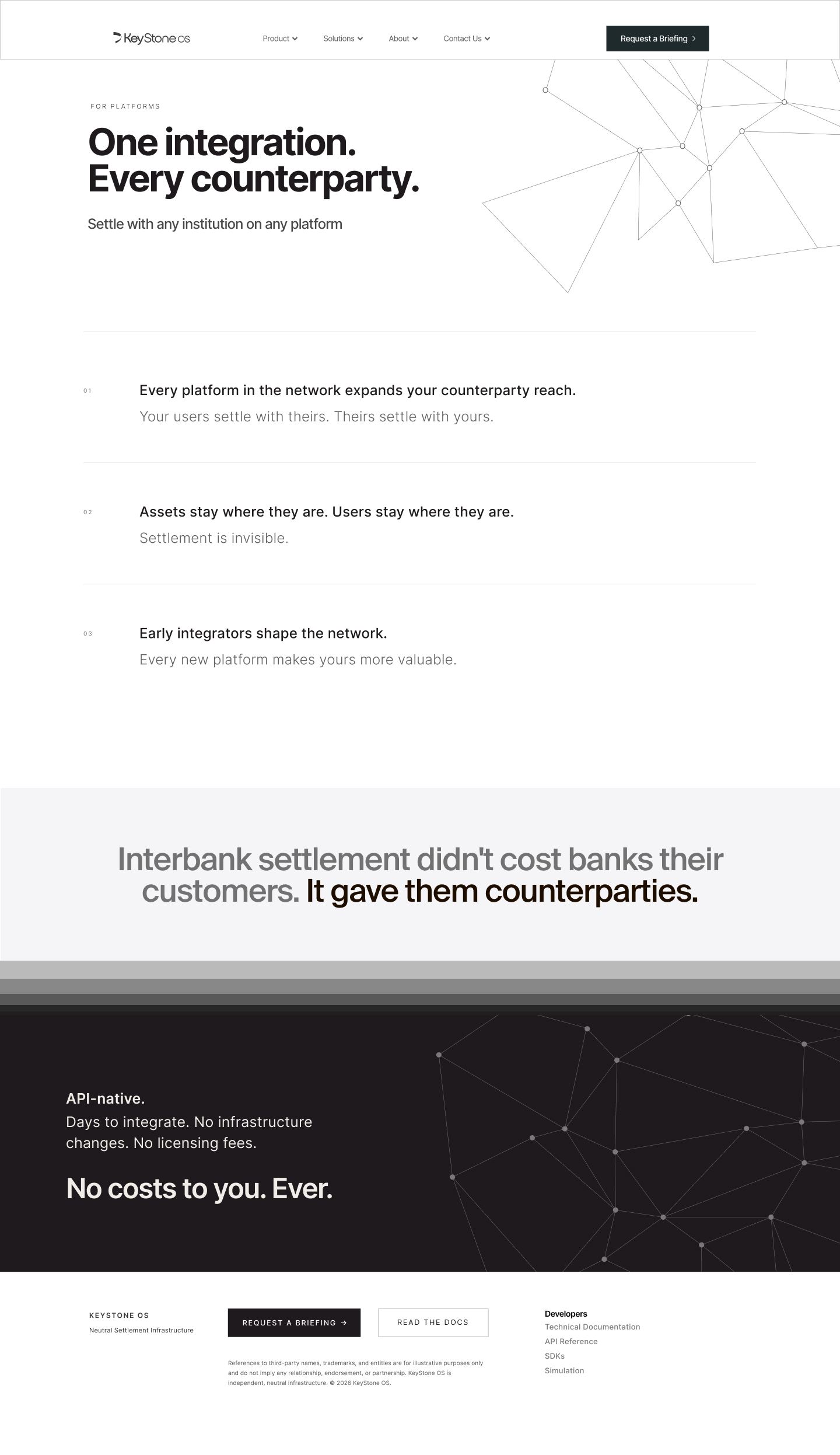
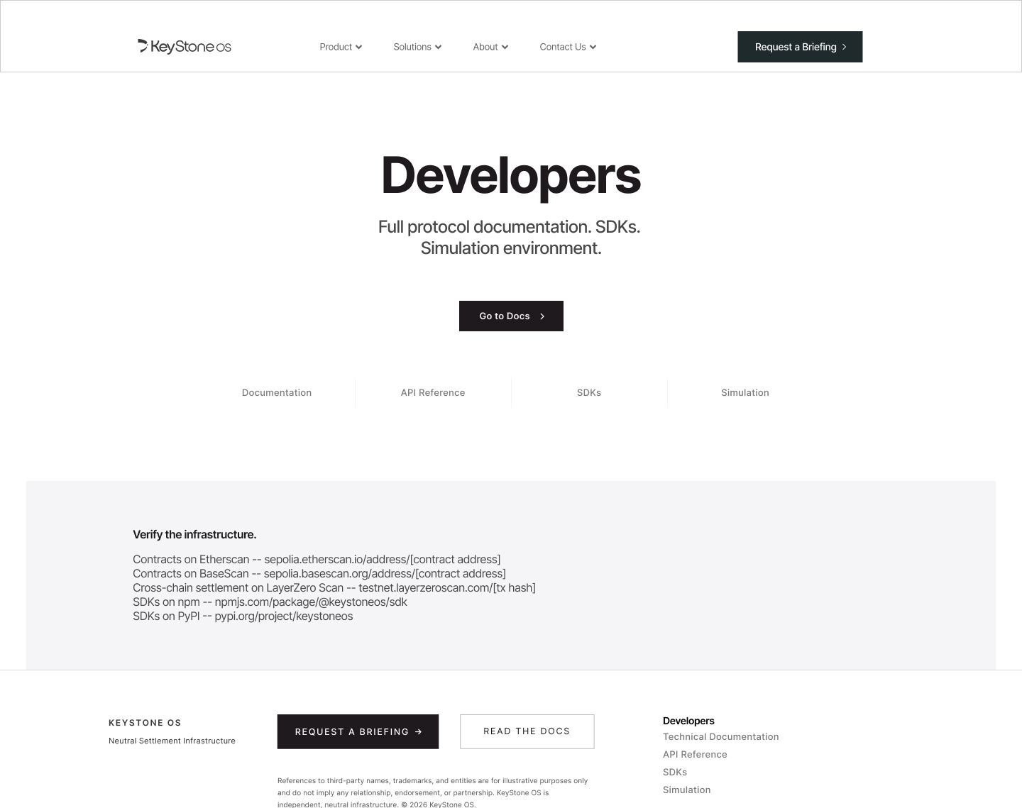
Four pages, zero noise.
[ The line that holds it all ]

