

 EN
 PT-BR
[ Case 04 — Brand identity · Brandbook ]
KAKTVS Studios.
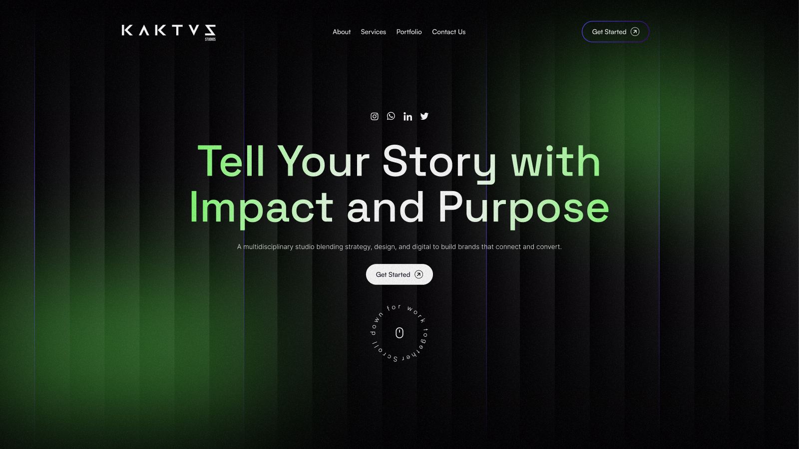
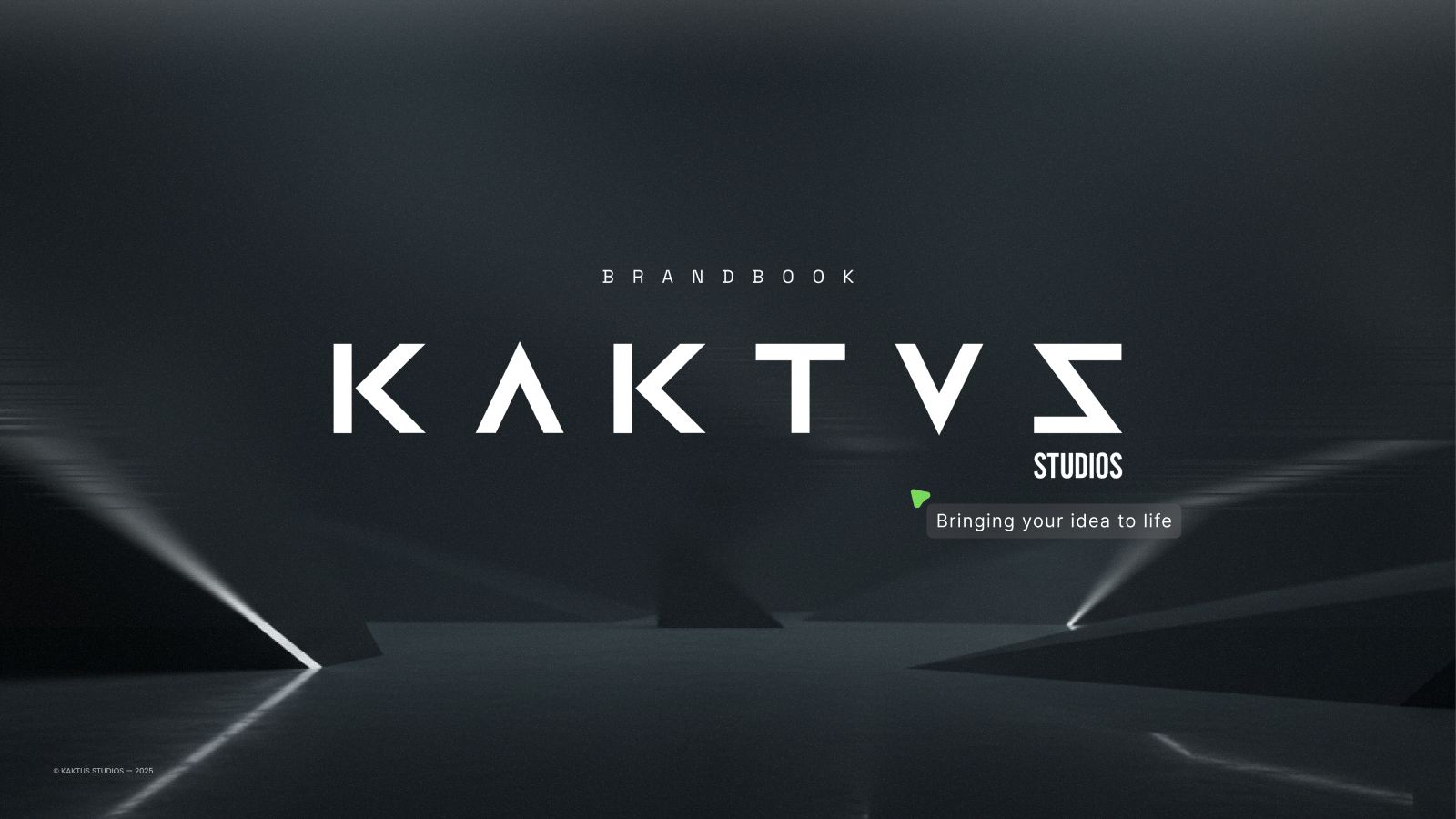
A creative studio that sells ideas — branding, content, web — needed one for itself. The brief was a brand that feels fast, sharp and confident, and a brandbook that works as the studio’s own pitch.
01 — The brief
A studio of ideas needed its own.
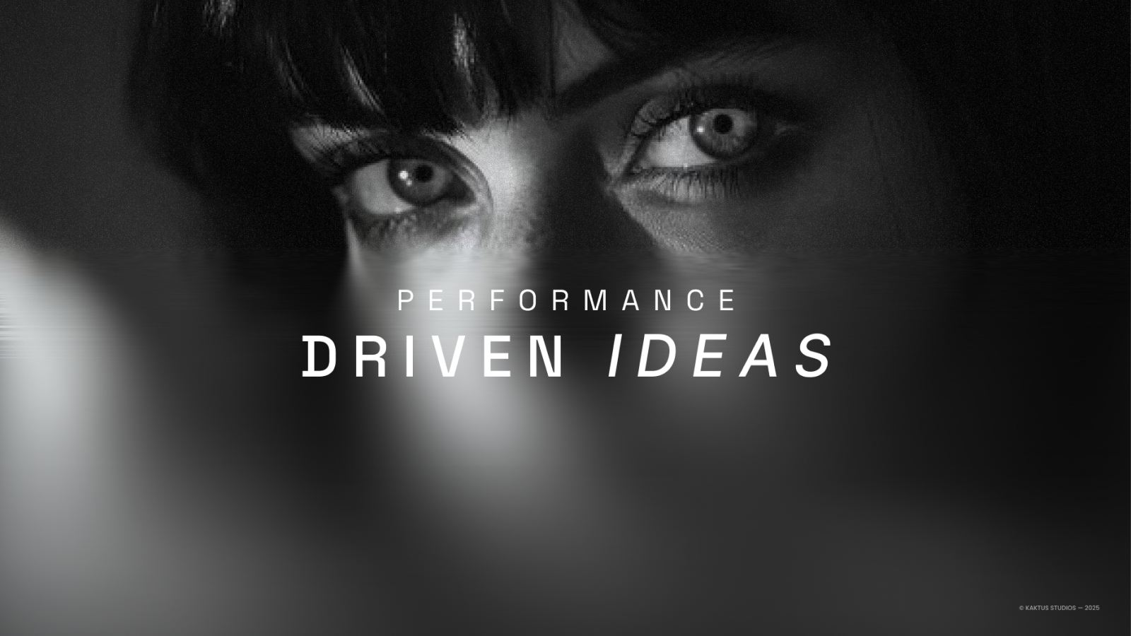
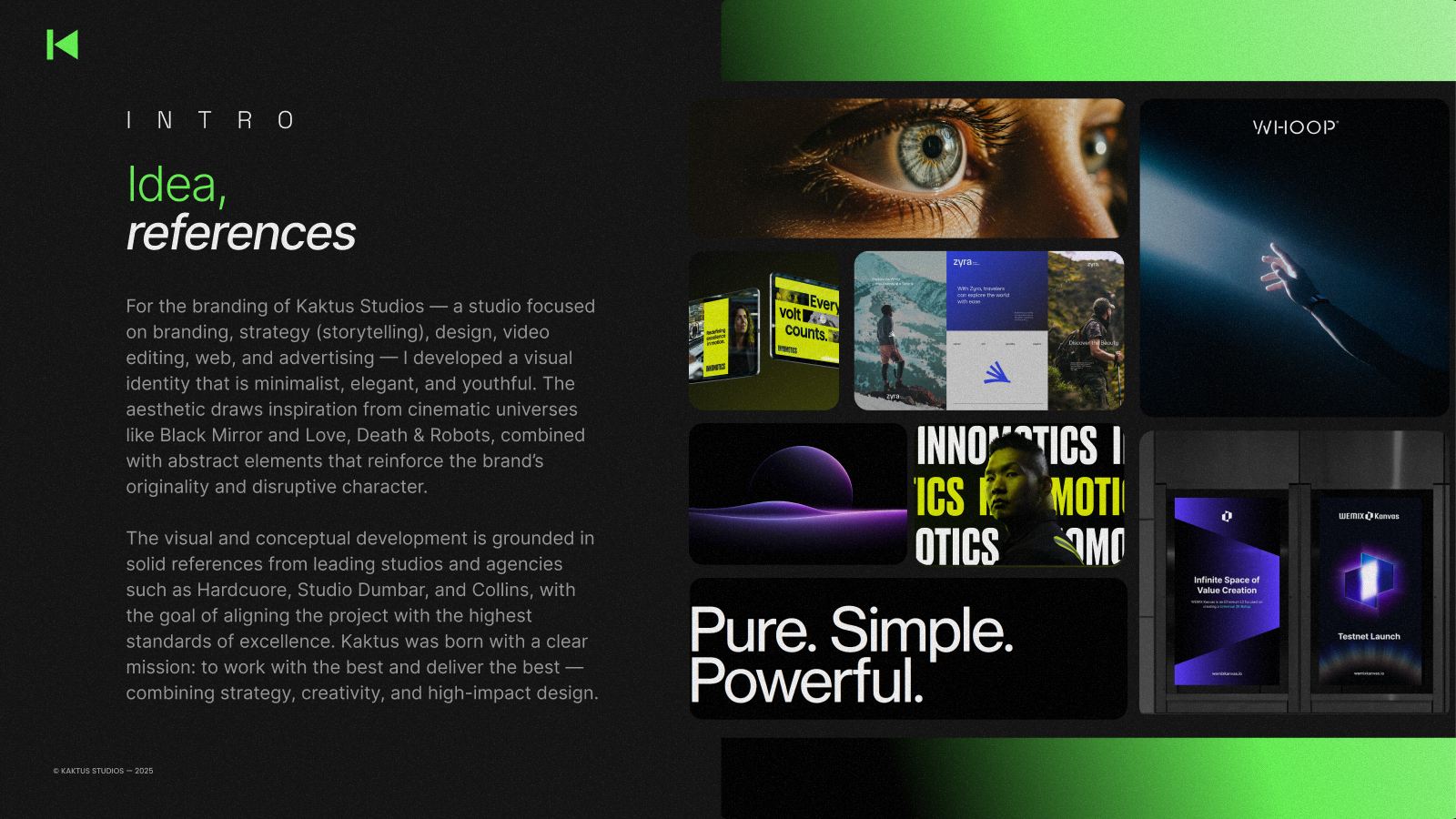
The references pointed one way: cinematic, minimal, a little dangerous. Dark rooms, single light sources, motion blur, tech that feels premium without shouting.
The trap was looking like every other “creative agency” — gradients and a lowercase wordmark. The brand had to have a single, ownable gesture and a system strict enough to survive any application.
02 — The idea
The K became play.
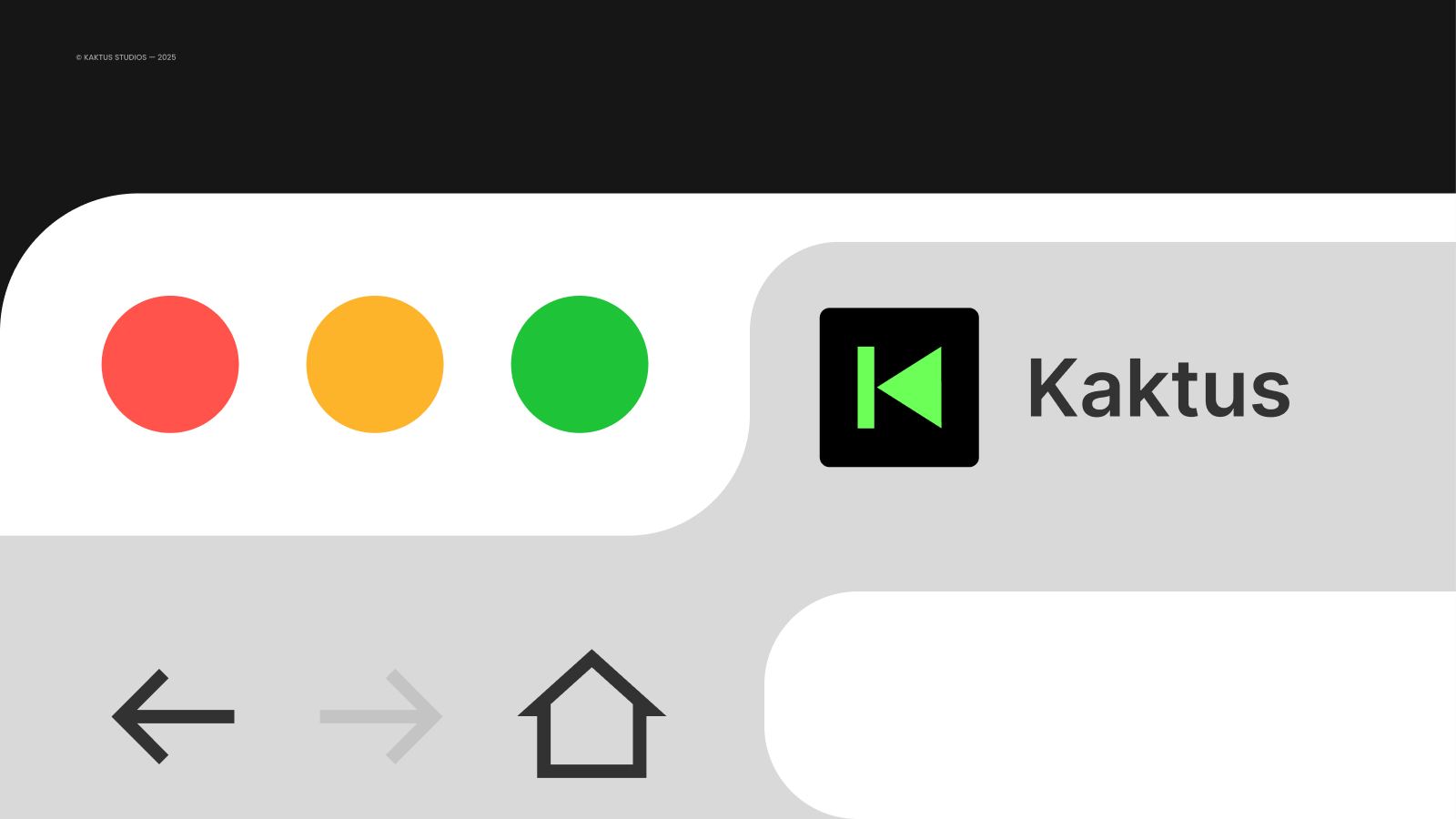
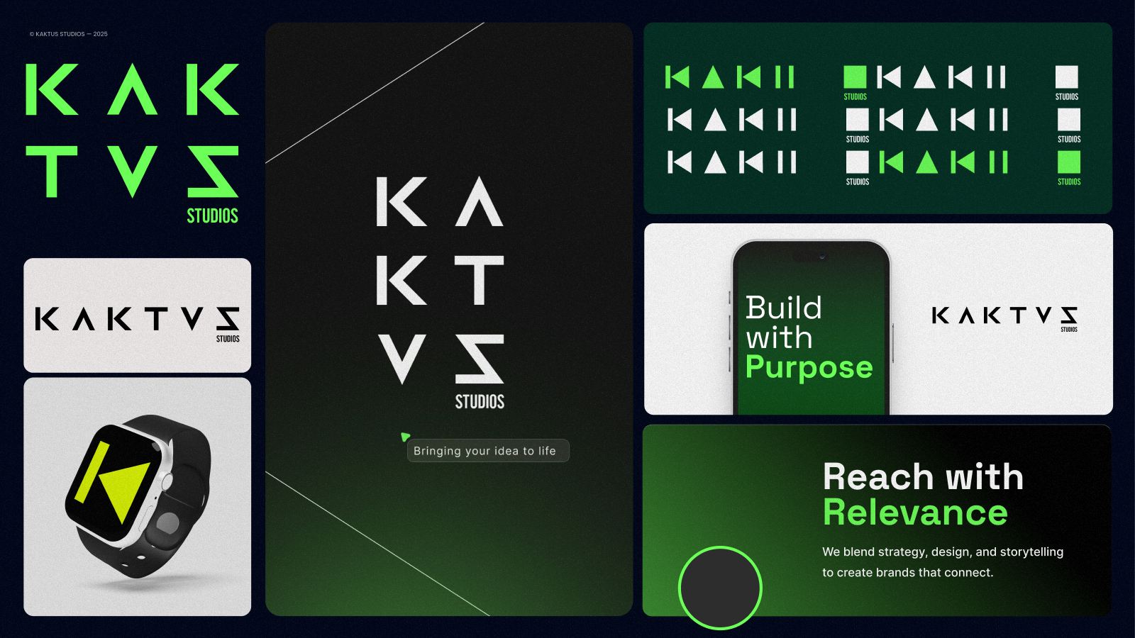
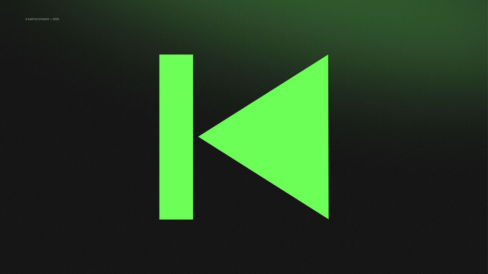
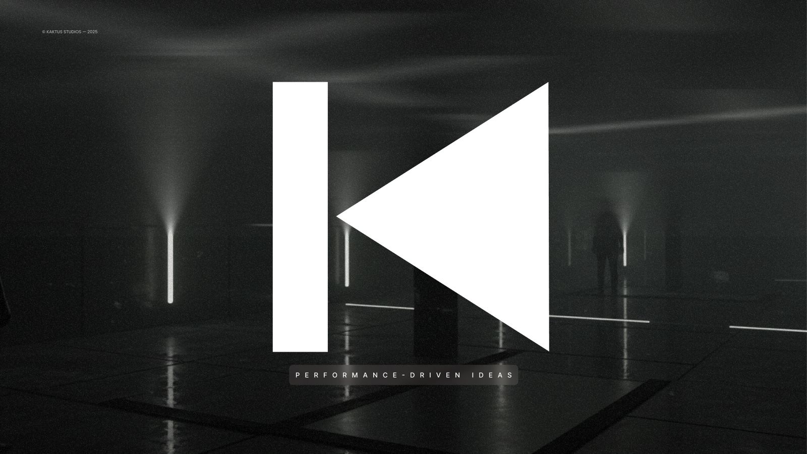
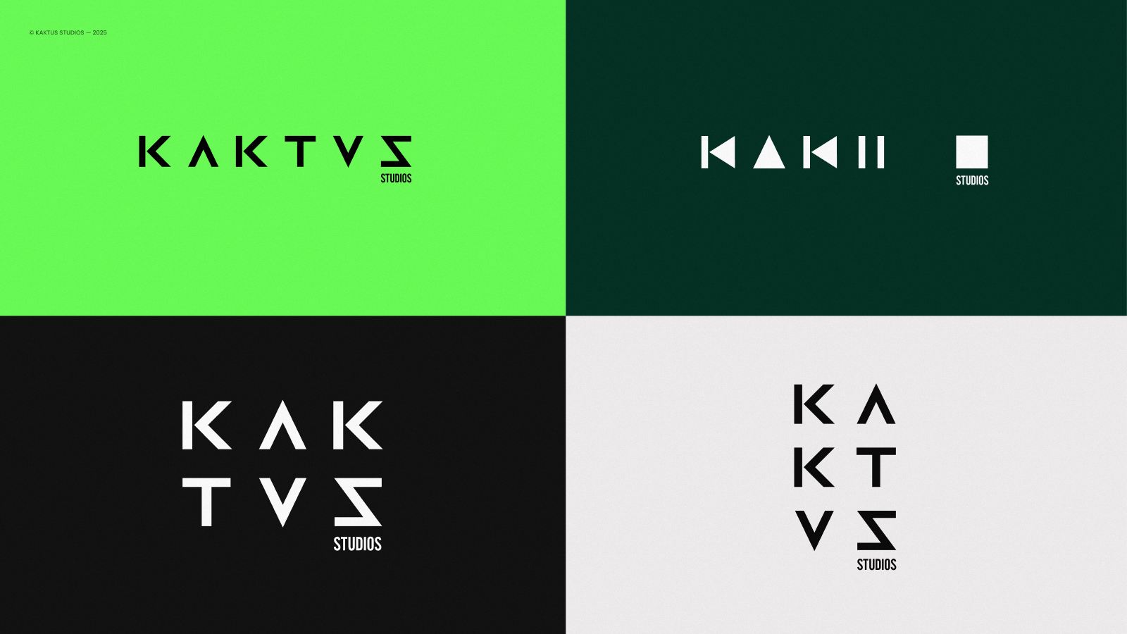
One bar and one triangle. Read it as a K, read it as a play button — both are right. The symbol says the studio’s whole promise in a single shape: take an idea and set it in motion.
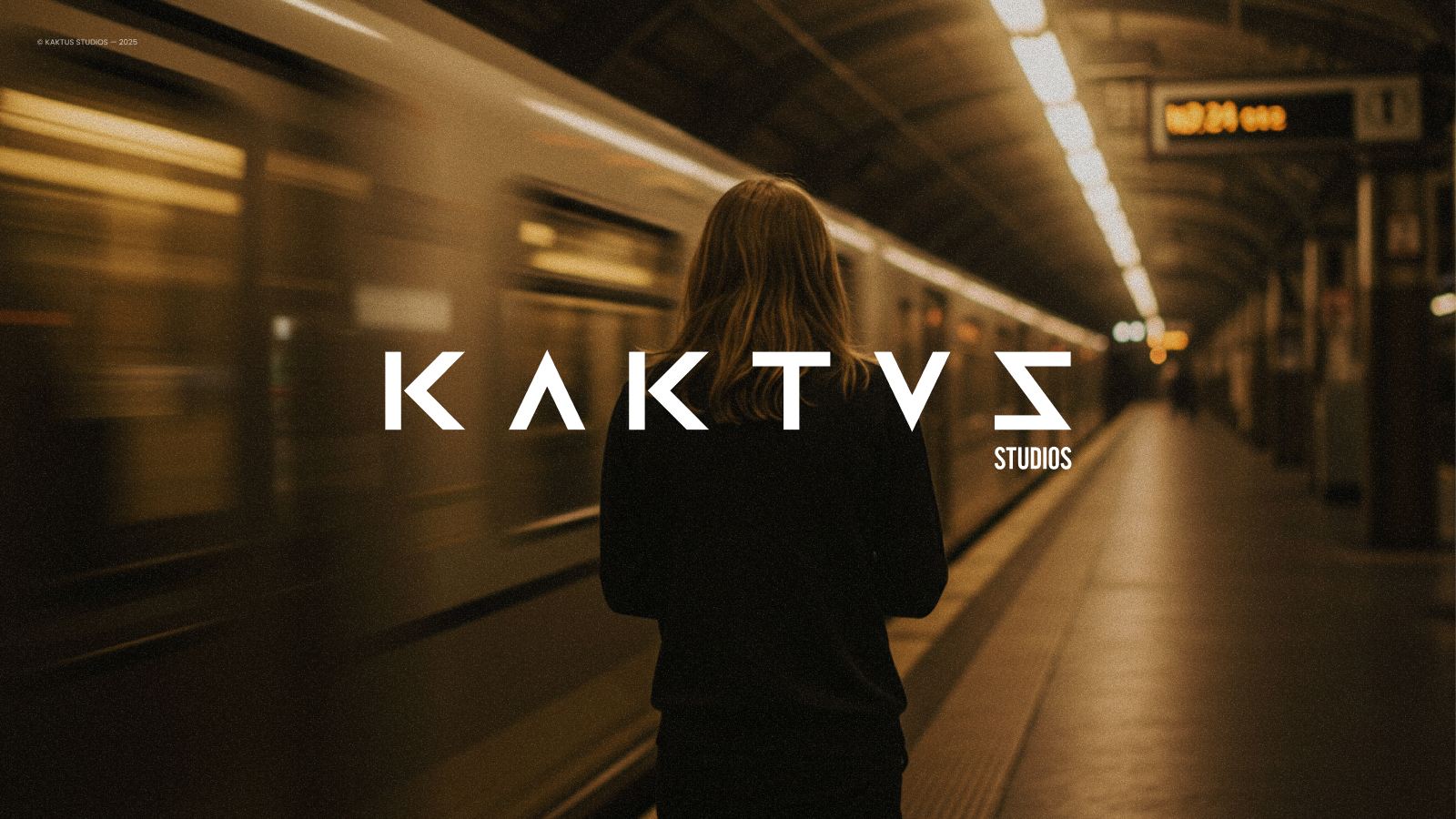
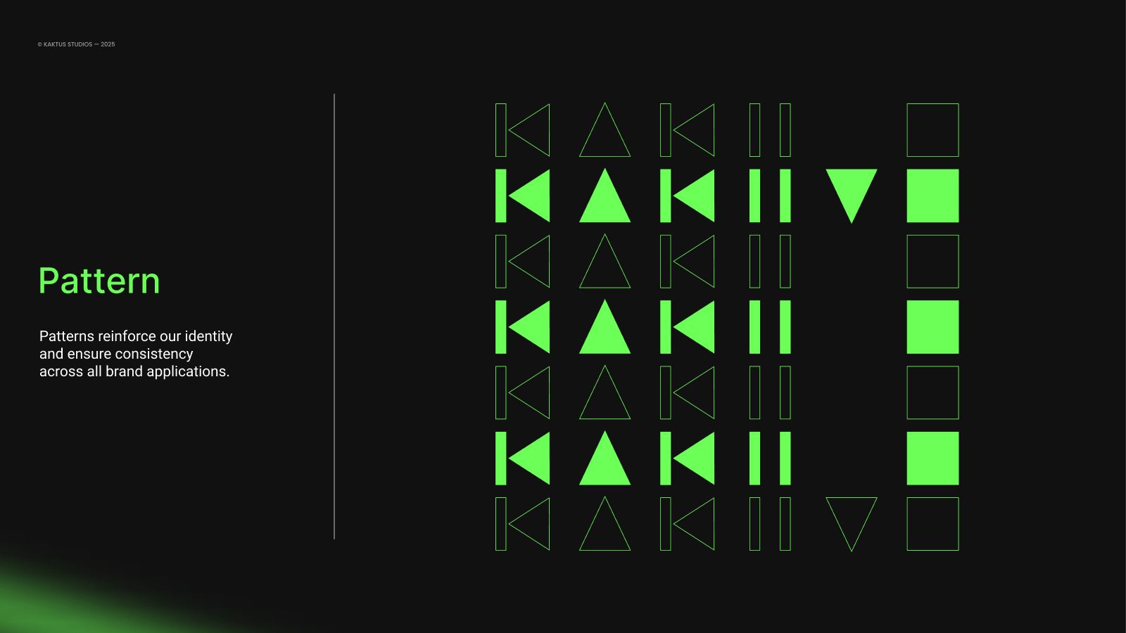
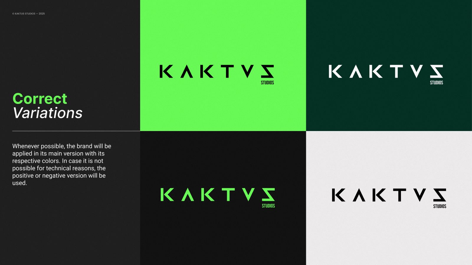
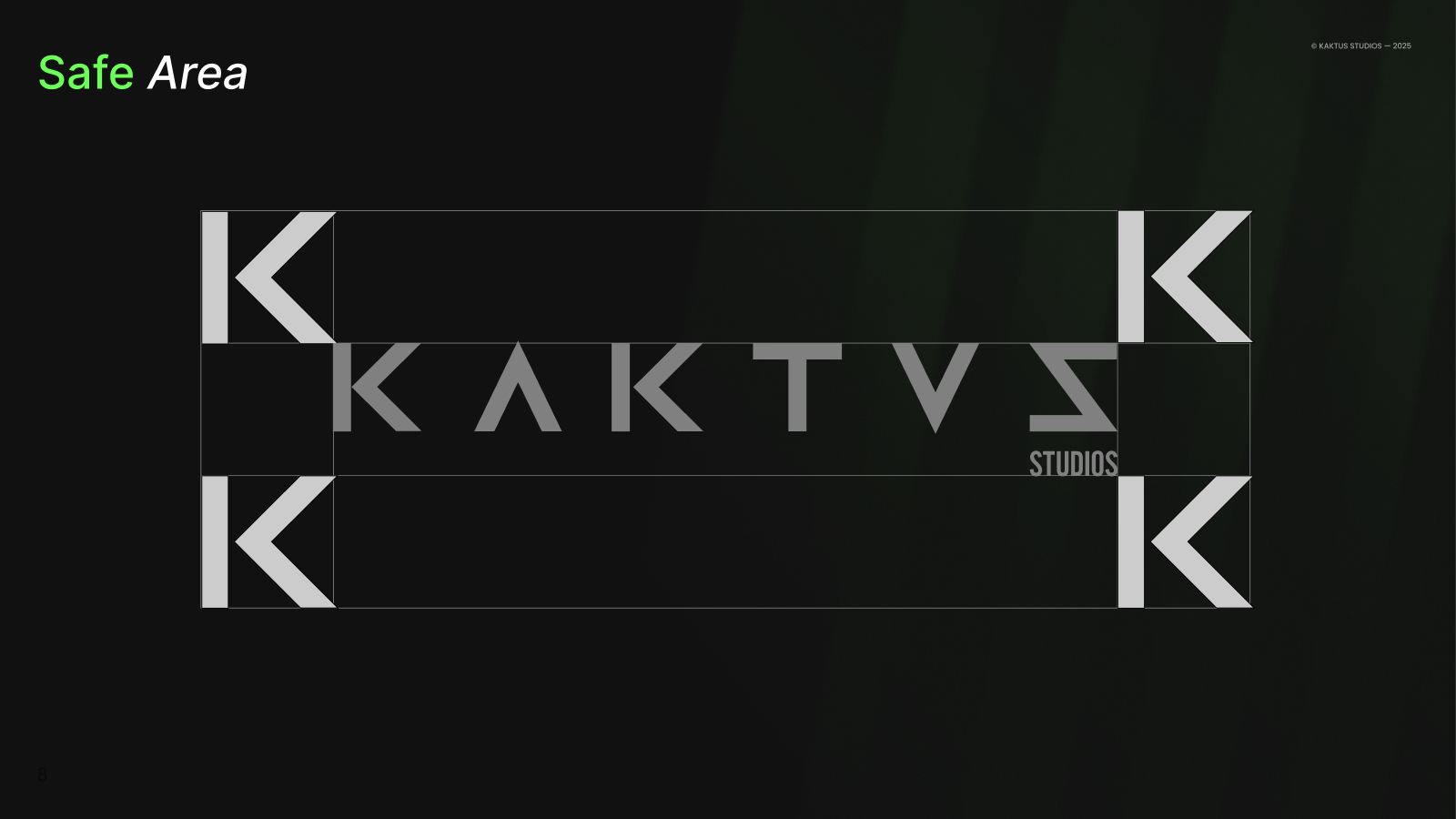
The wordmark goes wide and geometric, swapping the S for a sigma — KAKTVΣ — so the name reads like a code. The symbol then breaks down into a pattern of Ks, triangles and bars that covers the rest of the system.
03 — The system
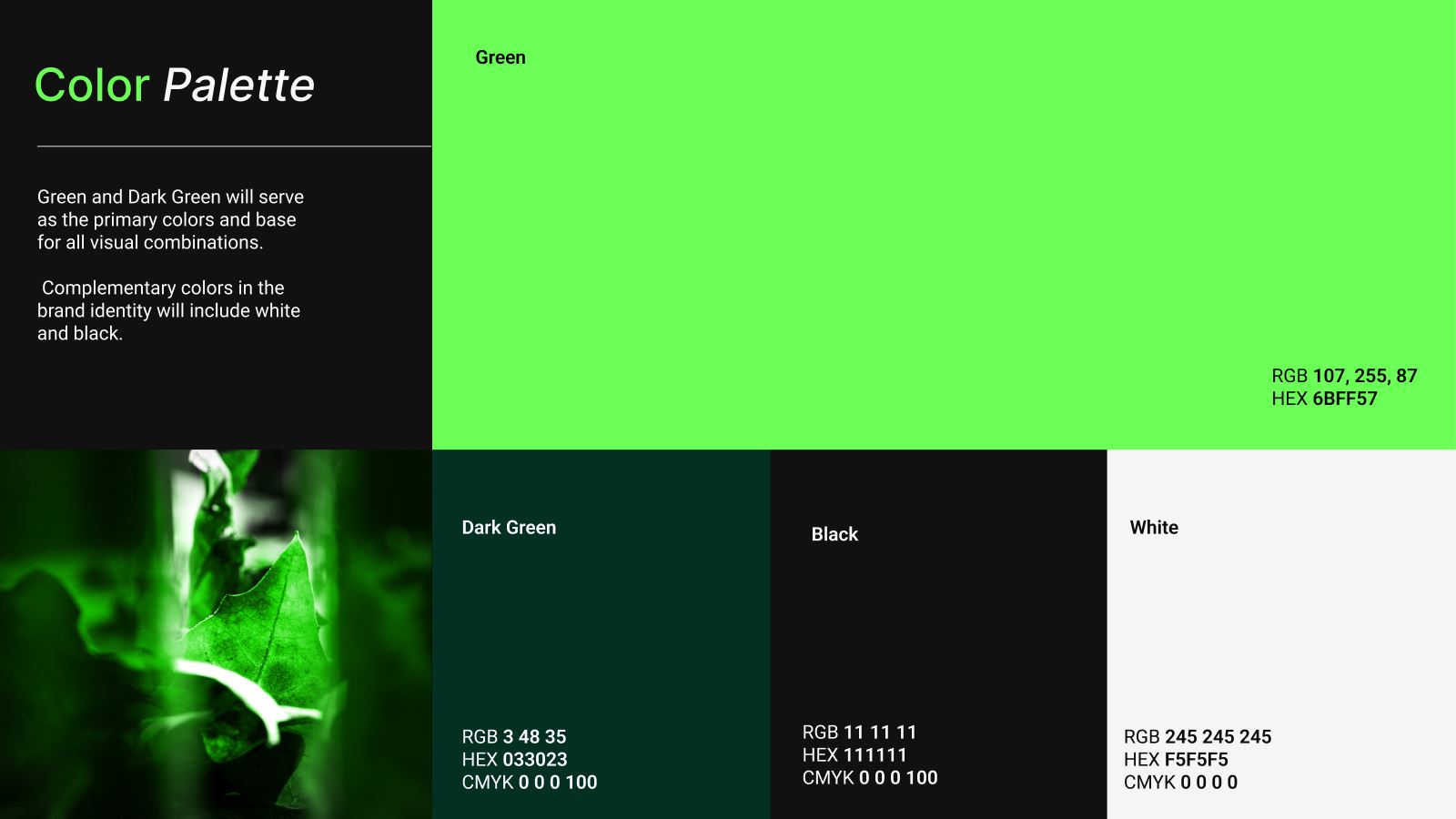
Neon on black. Nothing else.
Palette — click to copy
Typography
Aa
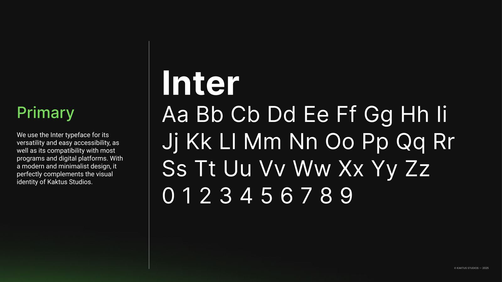
Inter — primary, everything
Space Grotesk — secondary, digital accents
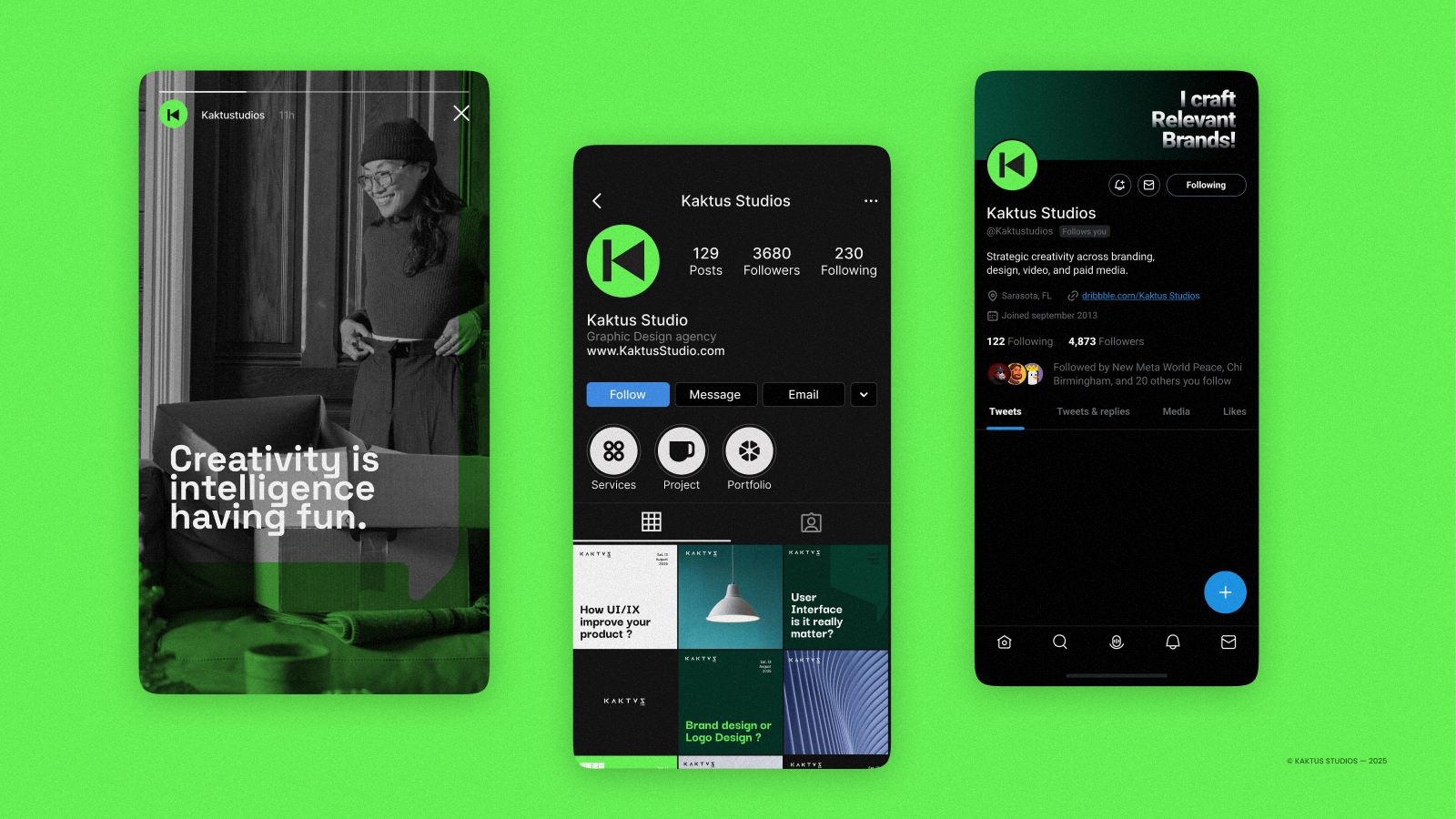
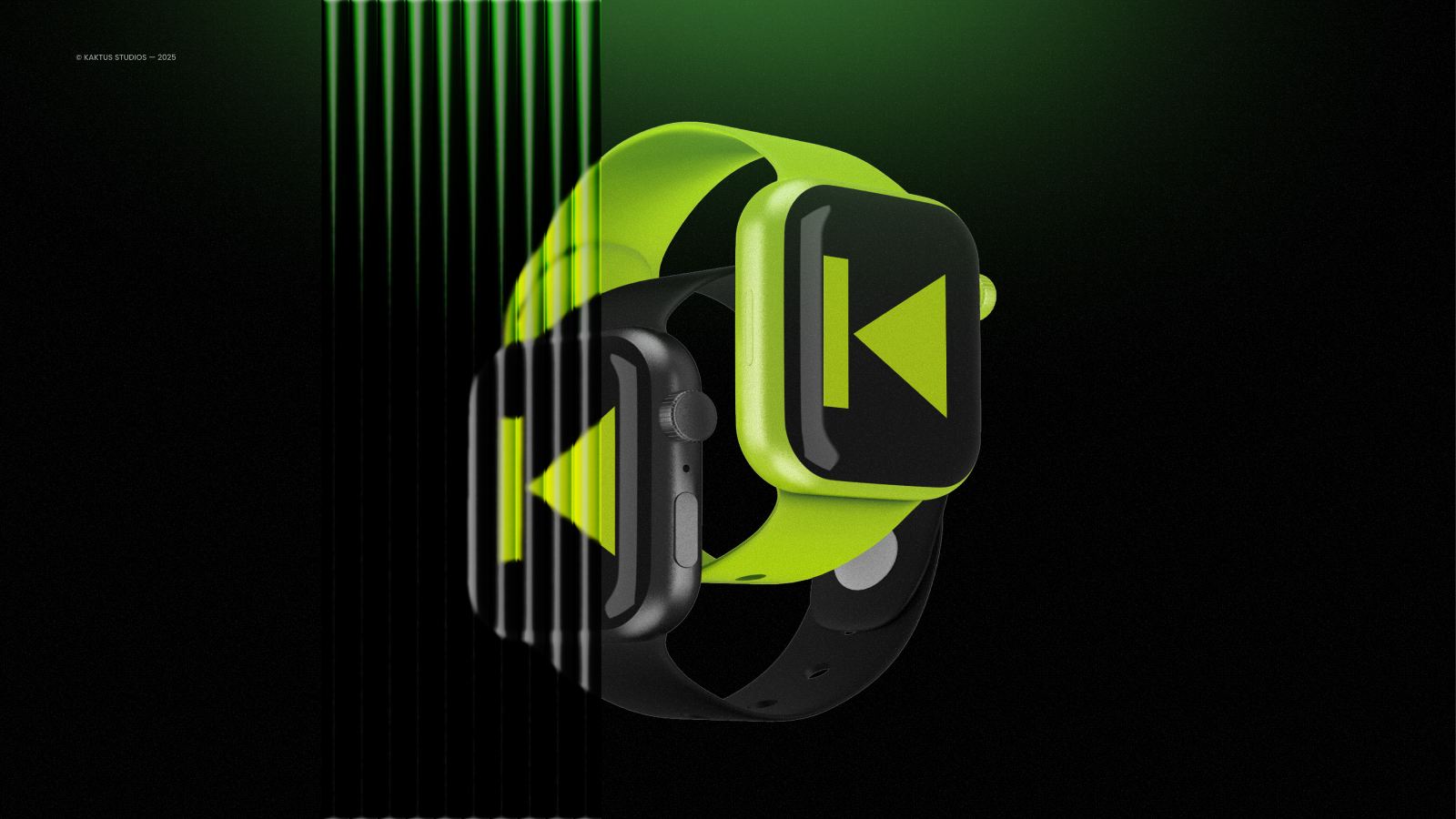
04 — In the world
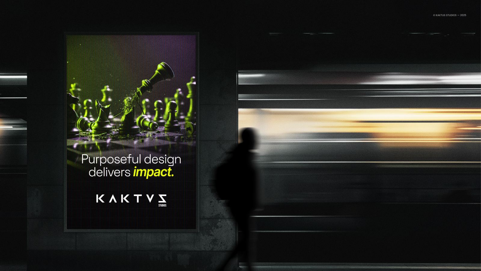
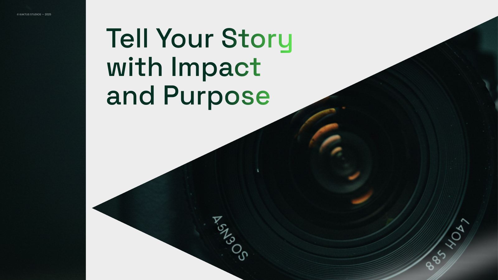
Built to move.